
Wardrobe Workshop recap
How to wear colour

Hi, I’m Leigh. I’m a stylist and my interest and passion for styling is focused on how we feel in what we wear. Dressing is a form of self expression and I work to empower people to align their sense of self with their style and gain autonomy to dress with ease, clarity and confidence.
Last week I hosted a Wardrobe Workshop in Byron Bay - an intimate group styling event, where I focused on colour - how to identify the shades and undertones that work for you and how to style it into your wardrobe.
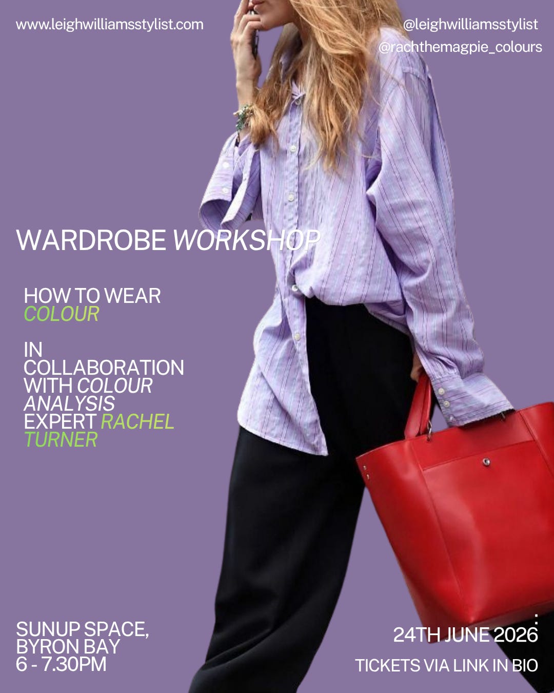
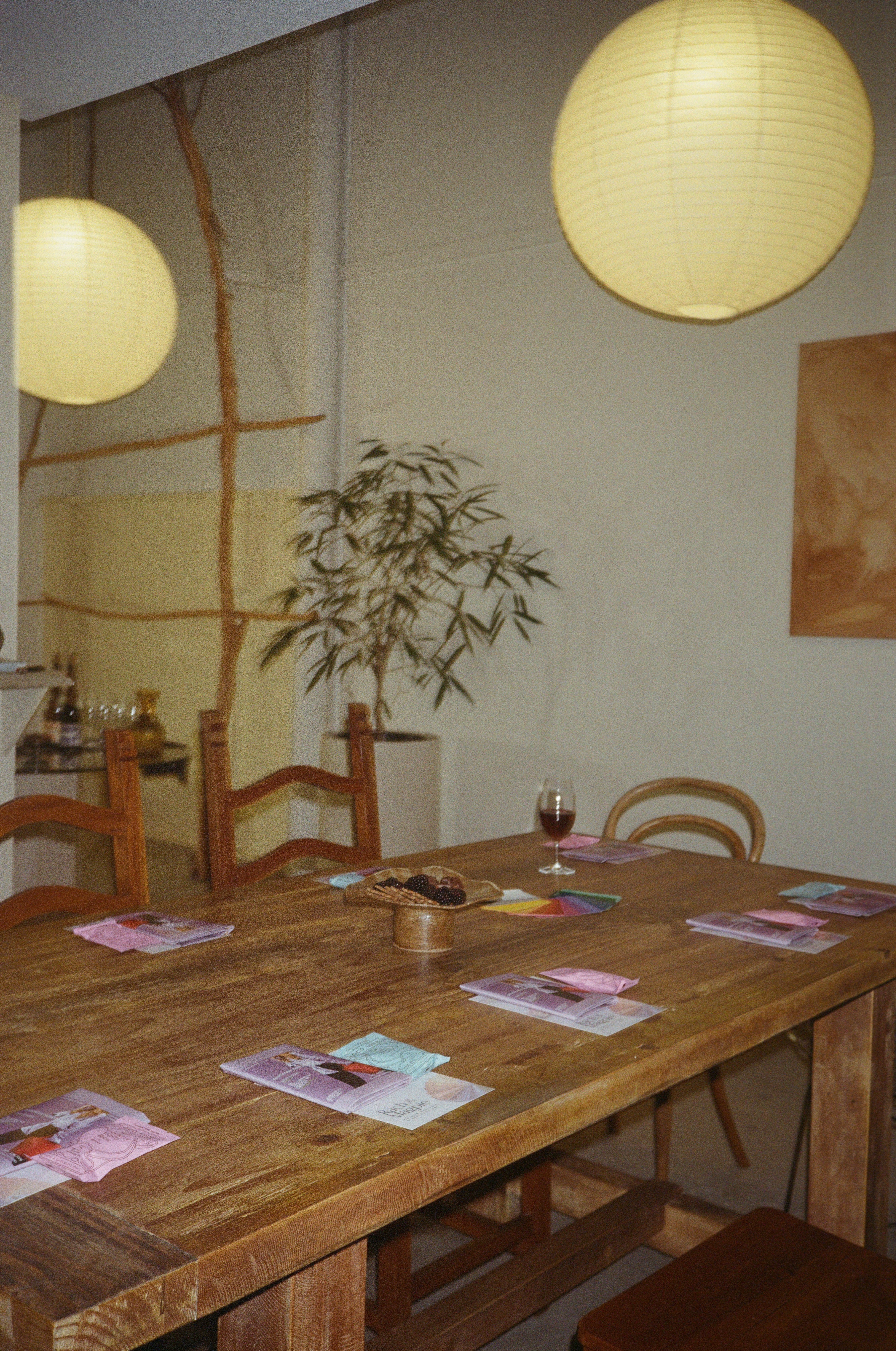
Held at beautiful Sunup Space, the evening was so fun! We drank wine from Luna Wine and enjoyed the yummiest chocolates from Loco Love.
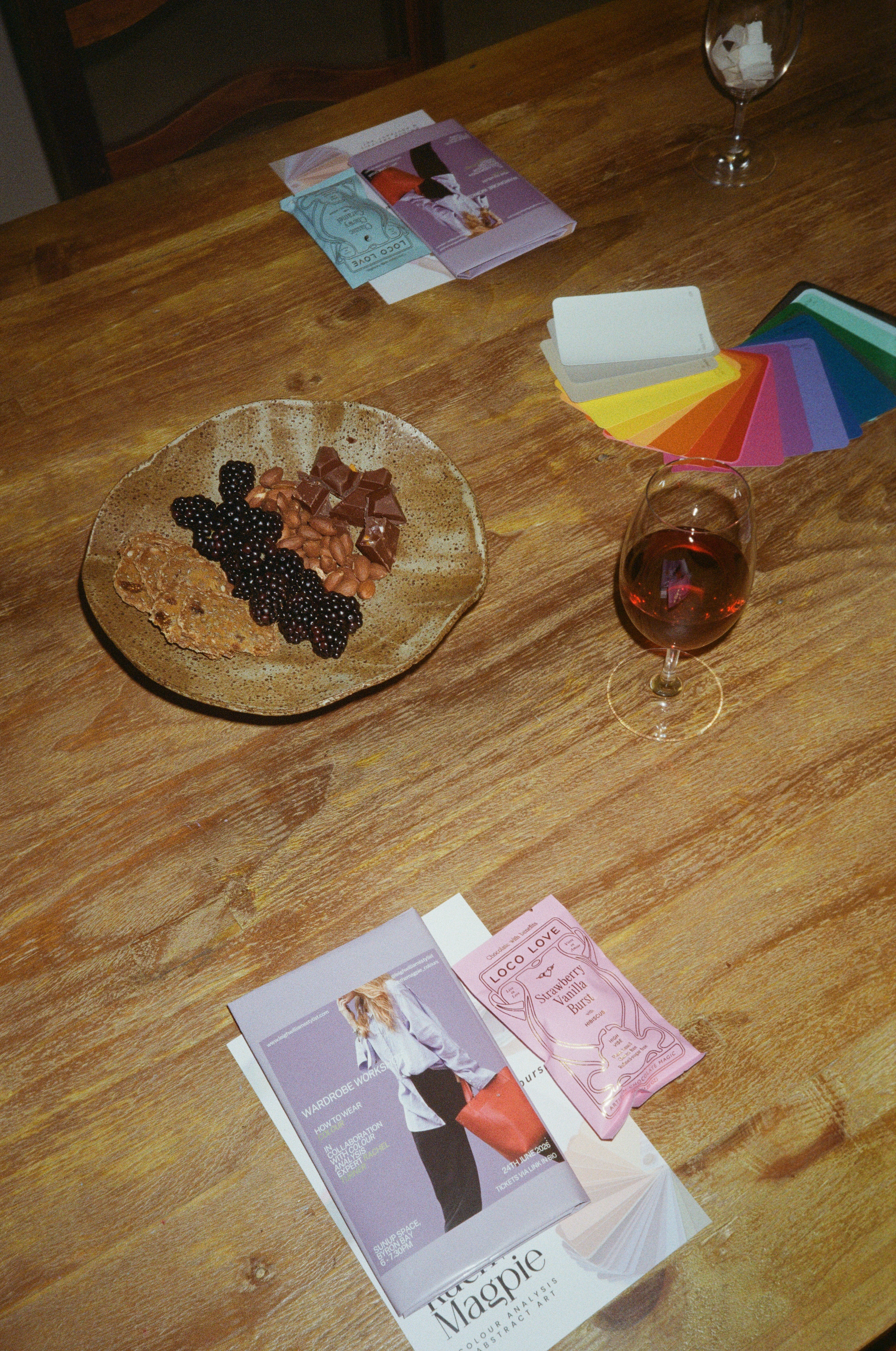


If you read my Substack on How to Wear Colour back in October, you’ll know I’ve been thinking about dressing with colour for a while.
Specifically why I, and many others, have stopped wearing (as much) colour in recent years.
Is it down to trends, personal preference, lack of shopping options, culture, ‘not our style’, or is it simply because we’ve lost the art of dressing in colour?
Maybe all of the above. But I’ve been curious to dive a little deeper and create a roadmap of sorts to help others - and myself - wear colour with instinct and ease.
Guiding women to understand for themselves what they like, what feels right for them and how they can implement that into their wardrobes in a way that feels aligned to them, is always my goal is.
So. This is what we discussed ..
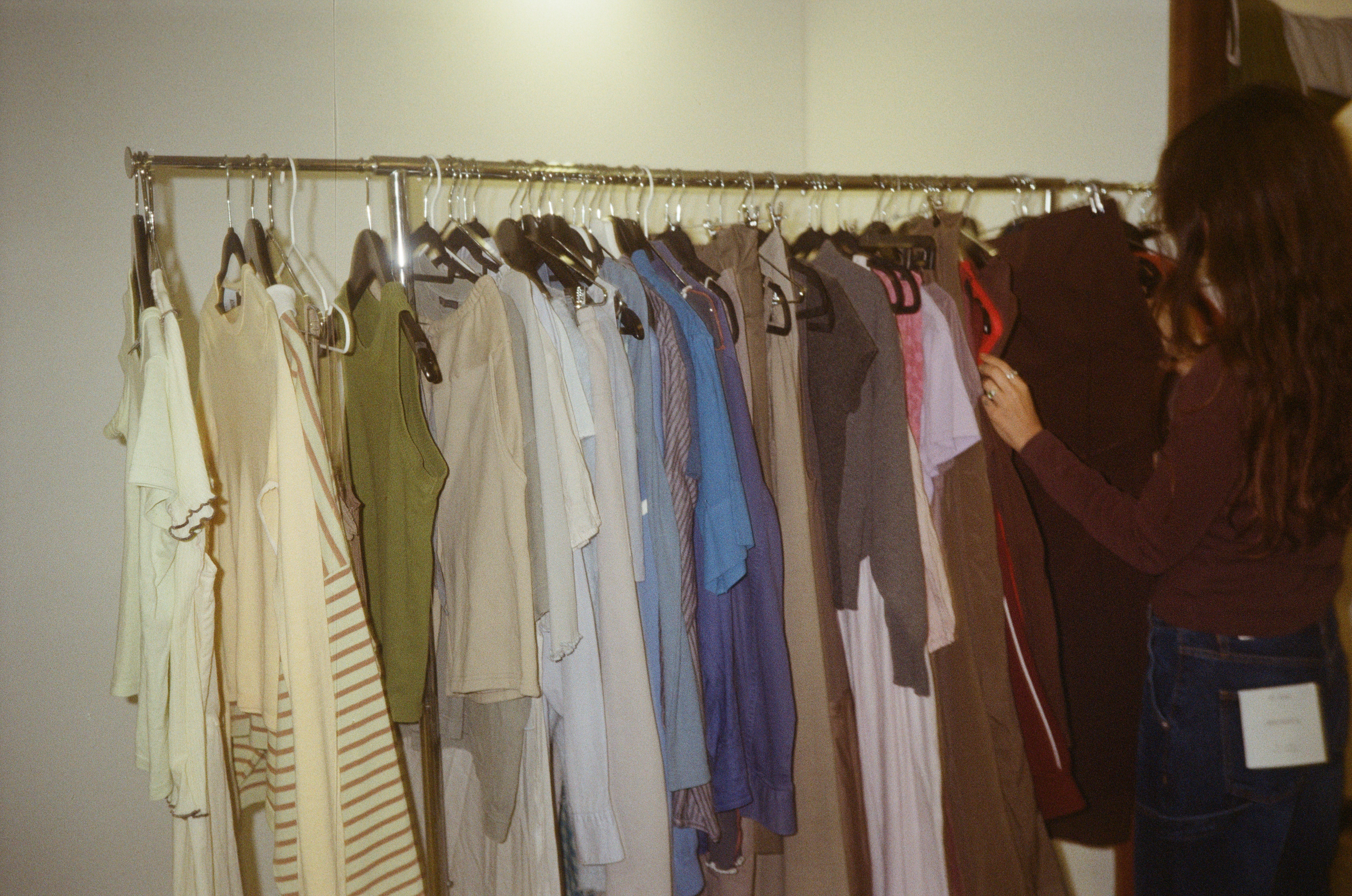
Discovering your undertone.
As I said, my focus with styling is always to empower women to follow what feels right for them - there is no rule book. If a colour feels right for you, you wear it. Period.
But sometimes a colour just feels off. And there’s a reason for that.
For this workshop, I enlisted the expertise of colour analysis expert Rachel of Magpie Colours to join us and analysis each of our undertones.
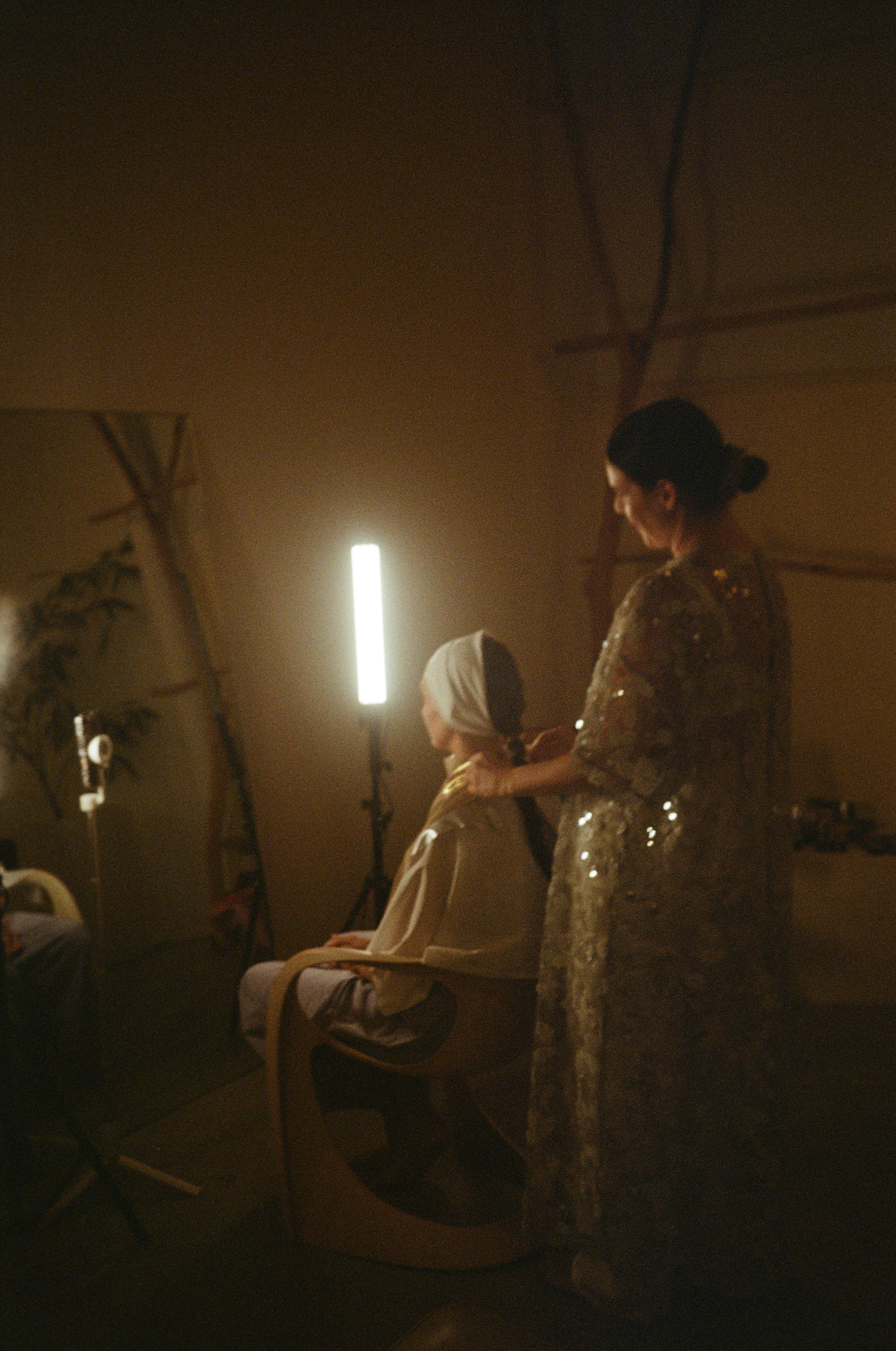
We each have either a cool undertone or a warm undertone and all colours have one or the other too.
So you may think you don’t suit red, but you will suit a shade of red with the undertone that matches yours.
I am a classic cool undertone. So wearing warm undertone colours looks off on me.
And when I looked through my wardrobe upon learning this from Rachel, I noticed all of my clothes had a cool undertone - not a single warm shade was in there.
And that’s instinct. I didn’t officially know I was a cool undertone until last week, but my instinct was always drawn to those colours - and I’d hasten a guess that yours is too.
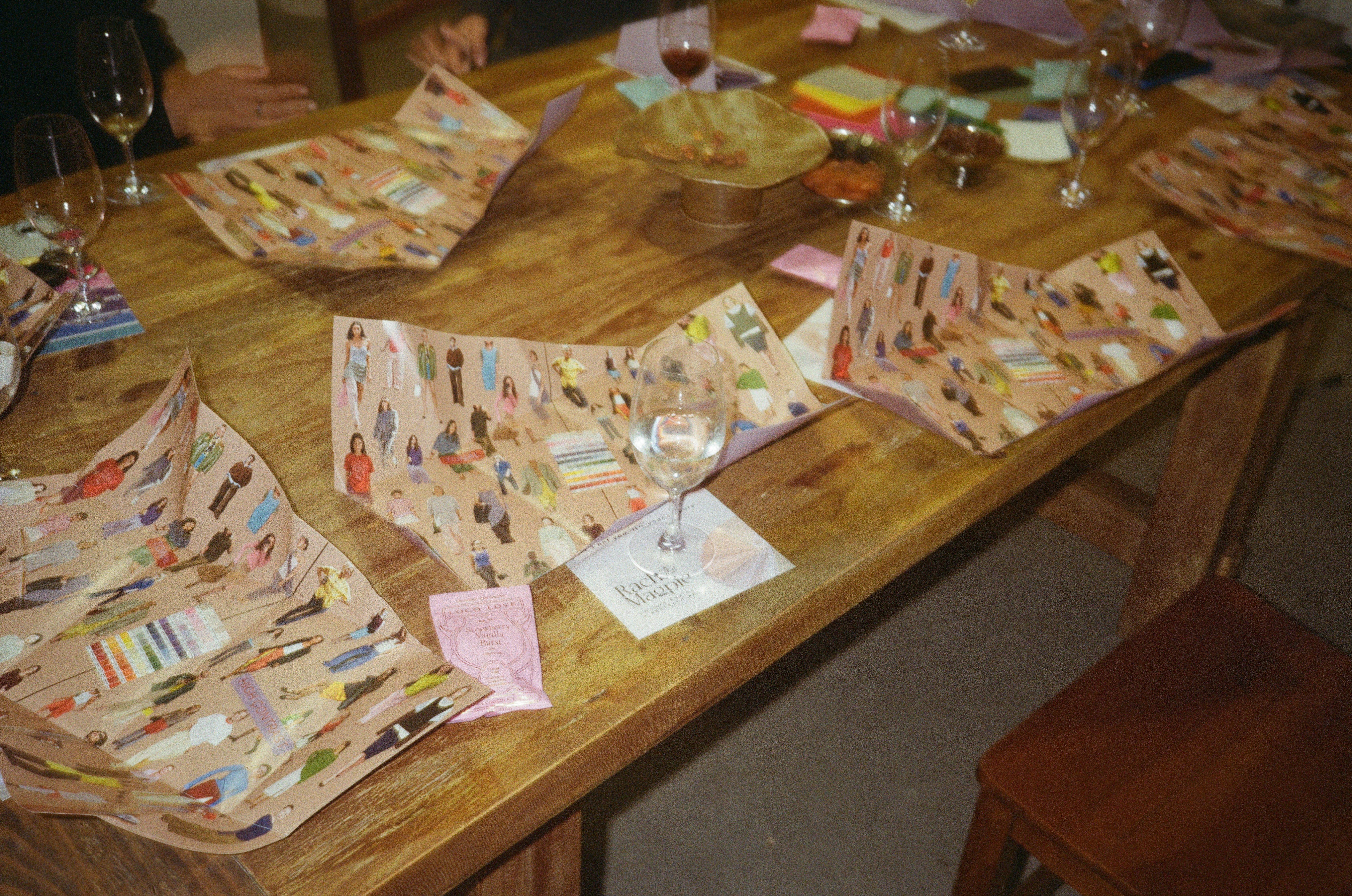
Rachel shared some wonderful insight around undertones and the make up and jewellery we can wear to help enhance your natural skin tone. She also emphasised the point that whilst this is helpful information, it’s not a sentence to which we must hold ourselves to. You may be a warm undertone but don’t let that limit you - if you want to wear something cool - then do it.
We can lean on tools to guide us, but never discount what you actually like and feel drawn to. Colour is meant as a form of self expression, so follow what brings you joy.
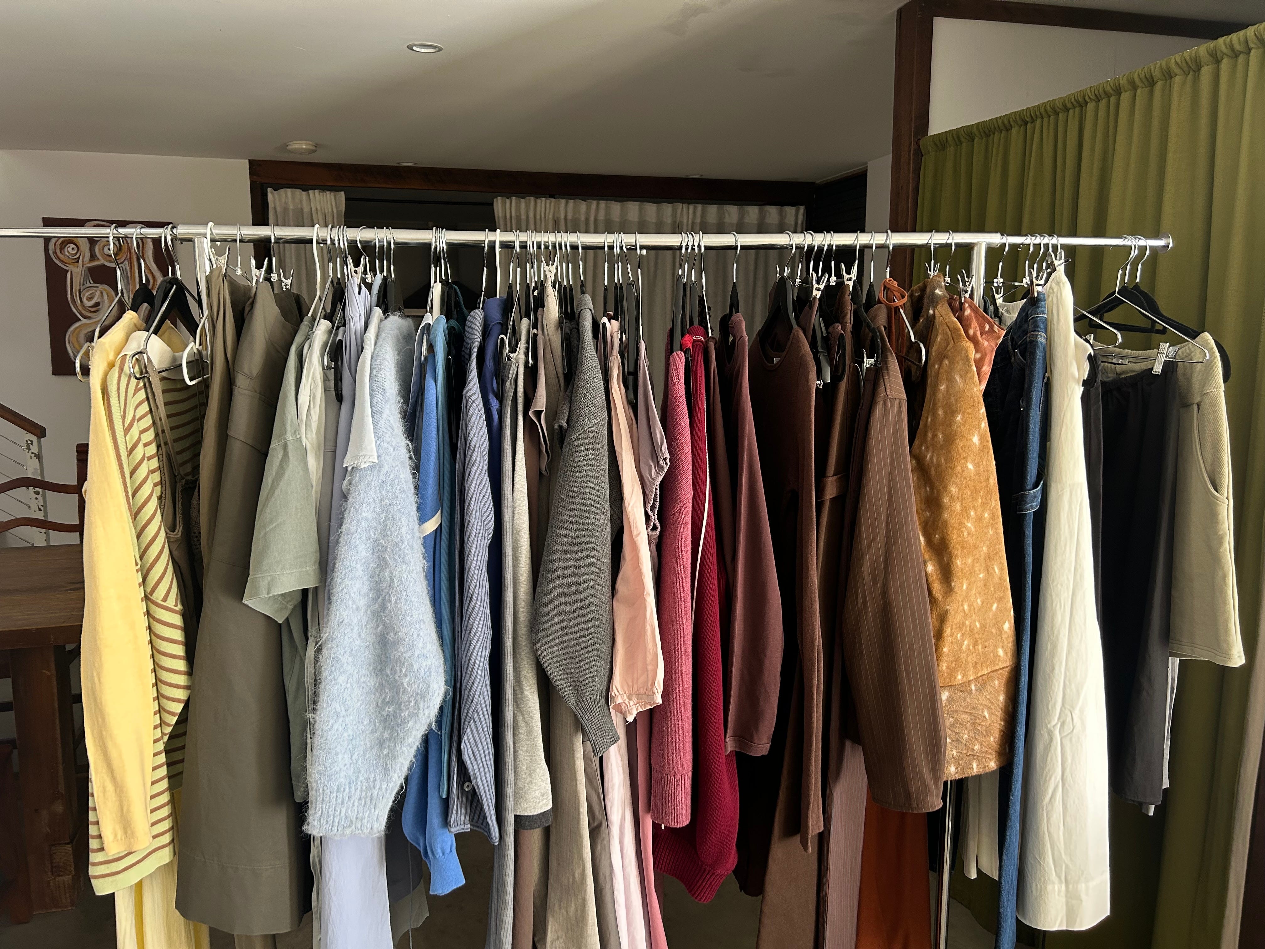
How to style.
There are of course many ways to style colour. And if you don’t already know about Amy Smilovic’s work with the Tibi Wheel, then I recommend watching this video. It’s brilliant.
If you’re new to consciously styling colour, I find it helpful to start with the following two approaches that I share with my clients. They are simple and easy to accomplish.
They are: Tonal and High Contrast.
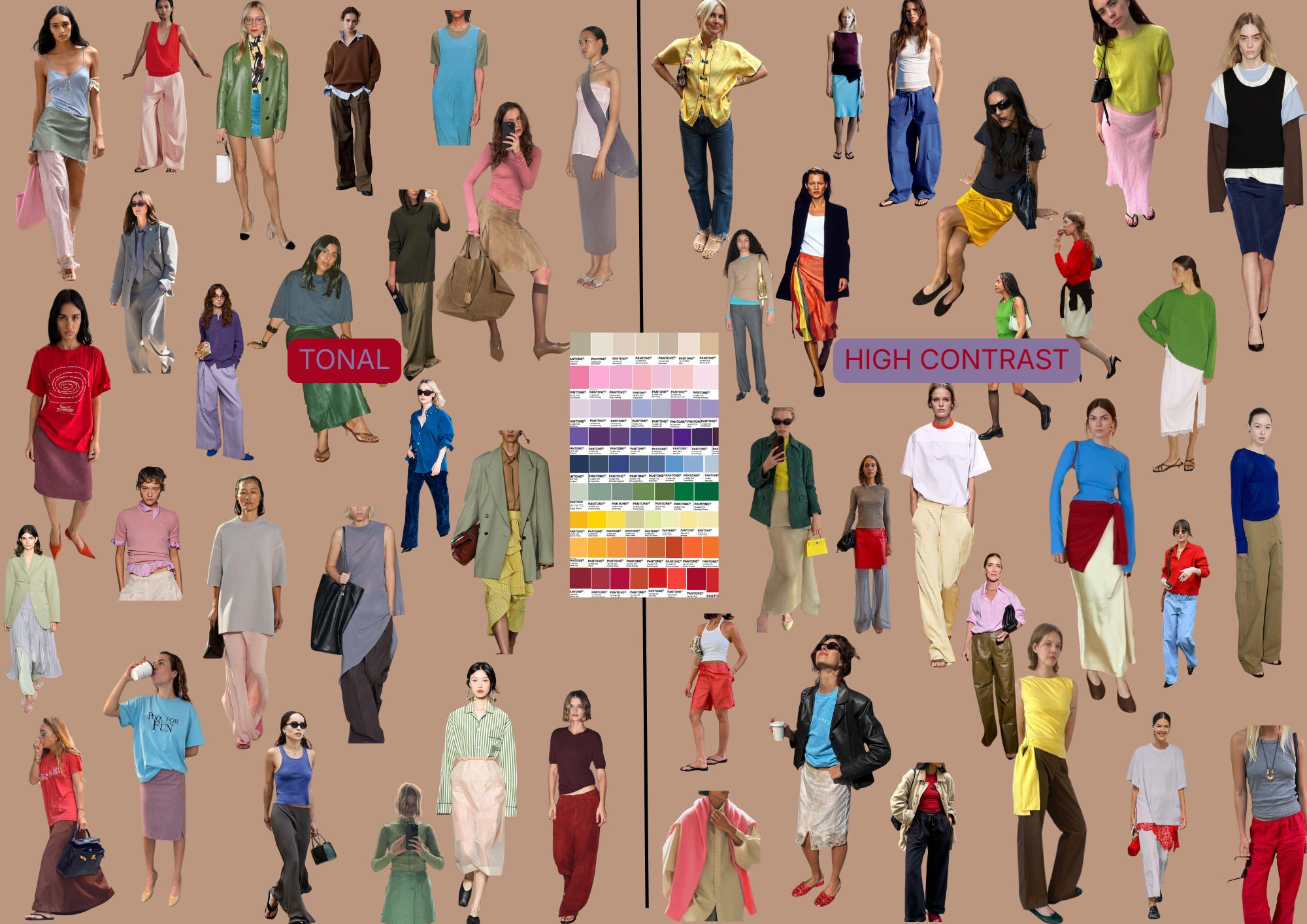
Tonal.
Aka colours that sits close together on a colour chart are tonally similar.
So by pairing a red t shirt with a deep purple skirt and pink heels - you create a tonal look. Your eye doesn’t go to one particular part of the look, but the whole thing.
It feels considered and put together.
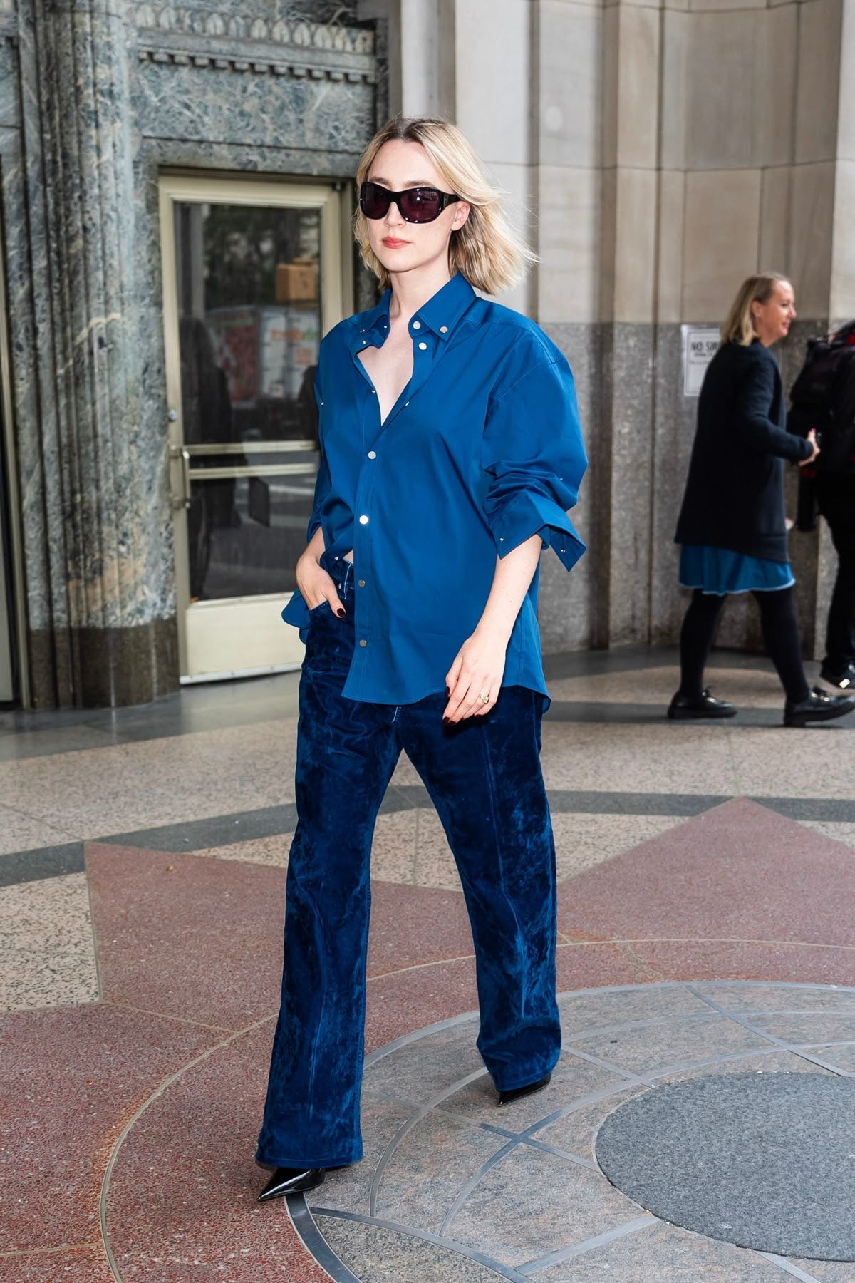
An interesting way to style a tonal look is to work with different textures. i.e green silk trousers, a dark grey cashemere knit and a brown leather loafer.
The use of different textures creates depth and interest. A perfect example below. Velvet navy trousers and a blue cotton shirt = cohesive and cool.
High Contrast.
Aka pairing colours that sit far away from each other on the colour chart.
For example - white and bright red. Yellow and brown. Cream and fuchsia.
This creates depth and interest and your eye will be drawn to the brightest colour.
Start with two colours.
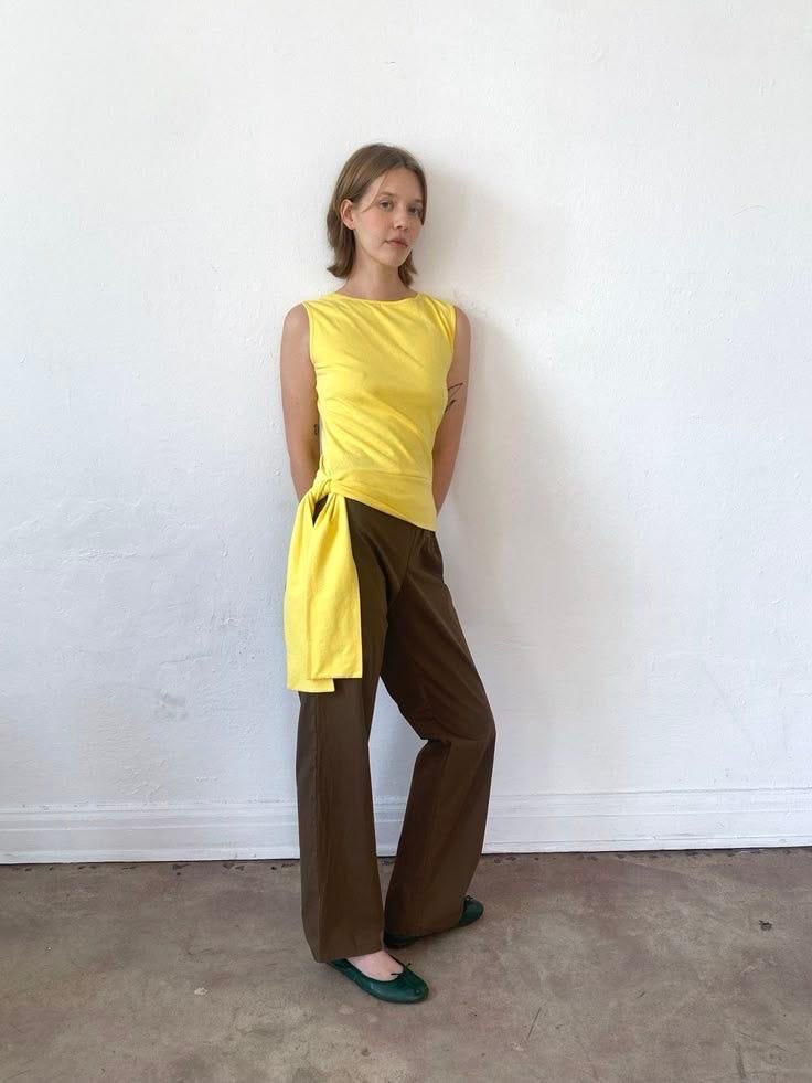
But you can also introduce a 3rd. (nb. I wouldn’t recommend a 4th in a high contrast look, but you could do a 4th colour in a tonal look.)
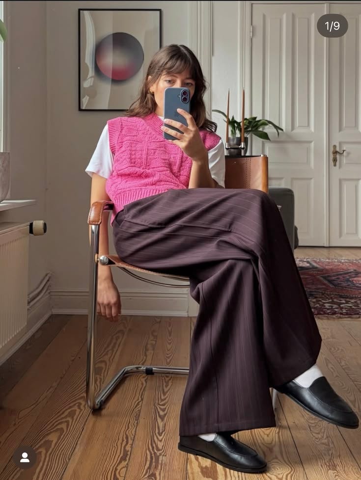
Pick x2 colours that are tonally similar and add in a third high contrast colour. Like the below. Pink and burgundy + white being the high contrast.
Give both approaches a try - see what you like.
As with anything in our wardrobes, experimentation and trial and error are the key to understanding what works and feels right for us.
Try adding colour with your accessories too - a red handbag with an all white look is great. And if you love a particular colour but it doesn’t suit you, wear it on the bottom half, away from your face.
There are no rules. But hopefully these guidelines help.
The workshop has definitely inspired me - I’m having a more colourful summer so far.


Stay in the loop with upcoming workshops here. And reach out, should there be a topic you’d love to see discussed.
If you know of a friend who may like or benefit from this, please share with them.
Links to my ShopMy.
How to work with me:
1:1 Wardrobe Styling sessions available, held via zoom. Book a complimentary, no obligation discovery / intro call here.
Read what people are saying here.
Linktree for website and offerings here.
This is a newsletter dedicated to style, thoughts, and self expression by stylist and consultant Leigh Williams. The best way to support is by forwarding this to a friend or becoming a paid subscriber for additional benefits such a 20% off a Wardrobe Styling Session.